Digital Wayfinding — Dubai Mall & Beyond
Designed touchscreen kiosk, digital totem, and digital directory experiences for the UAE's highest-footfall destinations including Dubai Mall, Mall of the Emirates, and City Centre Malls. High-traffic, accessibility-critical interfaces used daily by millions.
Client
Nearbuy Group LLC
Year
2017–2019
Type
UX Design
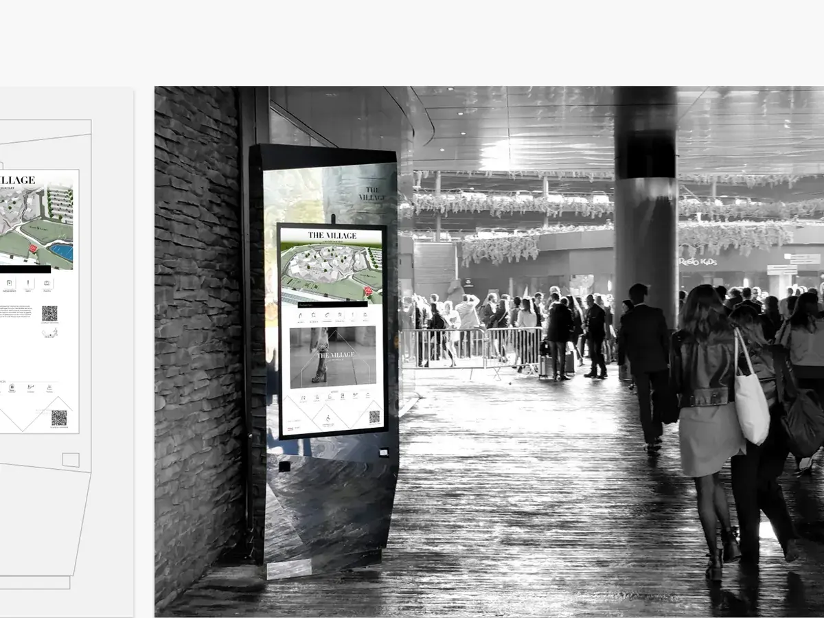
Designed touchscreen kiosk, digital totem, and digital directory experiences for the UAE's highest-footfall destinations including Dubai Mall, Mall of the Emirates, and City Centre Malls. High-traffic, accessibility-critical interfaces used daily by millions.
The venues were among the busiest retail environments in the world: The Dubai Mall, Mall of the Emirates, City Centre malls. People arrive tired, carrying bags, often not reading the interface in their first language, and they give a screen a few seconds before deciding it isn’t worth the effort.
Watching people use the existing directories was more instructive than any survey. Most failures were not comprehension failures. People either didn’t approach the screen at all, or they walked away during the pause before the map appeared.
The audience is genuinely plural. In a single hour a screen serves Emirati families, South Asian workers, European tourists and East Asian visitors. There is no shared reading direction and no reliable shared vocabulary of icons.
Wayfinding is a where-am-I, where-is-it, how-do-I-get-there problem solved under time pressure and social pressure. Nobody wants to stand in a public place looking lost, and an interface that makes someone feel slow is an interface they abandon.
The physical constraints bound as tightly as the digital ones: screen height and reach, glare from mall lighting, whether a child or a seated user could operate the thing at all.
The content never stopped moving. Tenants, offers, events and prayer times all changed underneath the design, so the layout had to stay legible while its contents churned.
I designed for the standing, distracted, one-thumb user: large targets, short paths, and an unmissable way back to the start. Any journey that needed a third level of navigation was treated as a design failure rather than a user error.
Arabic and English were designed together rather than sequentially. A bilingual layout is not an English layout with Arabic poured into it — line length, weight, numerals and the balance of a bilingual lockup all have to be resolved as one composition.
Prayer times and directions to the nearest prayer room were built into the wayfinder as a first-class feature, with a dedicated Salah Time panel. In this region that is a primary navigational need, not an optional extra, and treating it as one is a decision you only make if you have asked.
Accessibility was handled as a mode rather than a checkbox: a reachable-height view that moved the whole interface, not a token high-contrast toggle.
The system extended out to freestanding totems, mobile and web, so a visitor could begin at a screen and carry the journey in their pocket.
I also produced the tender presentation designs and pitch mock-ups the business used to win these venues in the first place, which meant designing the product and the argument for it in parallel.
Directory and totem interfaces went into service across some of the UAE’s highest-footfall retail destinations, used daily at a scale most product work never touches.
Kiosk, totem, mobile and web ran on one design language rather than four related-looking products.
The brand activation work — including the Perfumery & Co. fragrance finder — showed the same system could carry a retail experience, not only navigation.
The tender and pitch material built on the same design language, so what the client was shown and what the client received were the same product.
Want the detail behind any of this?
Discuss this project